
Flutter create your first custom widget
Today we will create our 1st custom widget for our flutter application. Example for our application we need some colorful text like green, blue , red etc.
Usually we know that flutter has a built-in text widget called Text. We can use a Text widget like the example below.
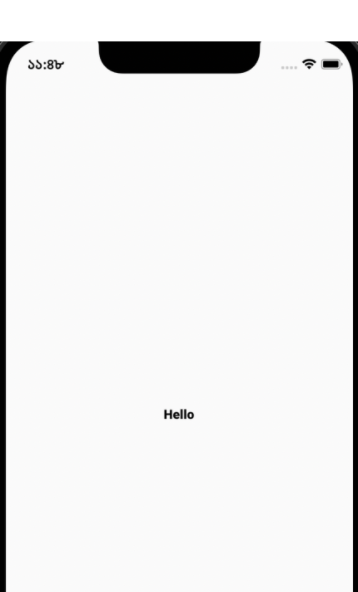
Build method in Main.dart
@override
 //build return widget tree
 Widget build(BuildContext context) {
   return const MaterialApp(
     home: Scaffold(
         body:  Center(
       	     child: Text("Hello")
    	 )
      ,)
   );
 }
Output we will get :
If we want to change our text color , our text widget will be looks like
Text(
"Hello",
style: TextStyle(color: Colors.red),
)
Output will look like :

Now in our apps it may require other text colors too, for example we need blue text or green text. So we want to create a custom widget for our text.
For that I’m going to create a file in location lib/widgets/color_text.dart , In color_text.dart file we will create a stateless widget. Initially it will look like the example below.
import 'package:flutter/material.dart';

class ColorText extends StatelessWidget {
 const ColorText({Key? key}) : super(key: key);

 @override
 Widget build(BuildContext context) {
   return Container();
 }
}
Now to create our color widget we need to change our ColorText widget, first in our widget we require 2 arguments 1 is text another is color. Example text is required , color is optional. If the user does not give any color, the default color will be black.
Note, here the text type will be String and the color type will be called Color. We can now change our widget class like below
class ColorText extends StatelessWidget {
 final String text;
 final Color color;
 // constructor with name arguments
 const ColorText(
   {Key? key,
   required this.text,  // non-nullable and required
   this.color = Colors.black  // non-nullable but optional with a default value
 })
 : super(key: key);

 @override
 Widget build(BuildContext context) {
 return Text(
   text,
   style: TextStyle(color: color,fontSize: 150)
  );
 }
}
Here const ColorText() is a class constructor where text is a required field and color is an optional field.
In the constructor we have used curly brackets for defining named arguments. Without curly brackets it’s a so-called positional argument.In build method where it will generate so-called widget tree, here he have returned Text widget with argument text and color.
Our widget is ready ! Now for use we need to import this widget in any of our pages or another widget file. Example we will import it in the main.dart file like below.
import 'package:miles_pro/widgets/color_text.dart'; Then we want to use it , so we can use it to replace the Text widget in the main function like example.
home: Scaffold(body:  Center(
       child: ColorText(text: "Hello")  // when we want a black text using our custom widget ColorText
 ),)
If you want to make your color red
ColorText(text: "Hello", color:Colors.red) Output :

Written by : Alimon Karim